Introduction: Breaking Through the “Sea of Sameness”
Imagine you are at a major stadium event or a high-end corporate retreat. You look around, and what do you see? A sea of standard colors. Navy blue t-shirts, red caps, white banners. While these are functional, they rarely ignite excitement.
Now, imagine a fan holding up a scarf that catches the stadium lights, shimmering in true gold. Or a VIP guest wearing a bucket hat with a silver logo that reflects the sun, screaming “premium quality.”
As a procurement manager or event planner, your goal isn’t just to buy products; it’s to buy impact. In the competitive world of sports marketing and brand activation, differentiation is currency.
One of the most underutilized yet high-impact design elements in textile manufacturing is Metallic Printing.
However, printing metallic colors on fabric is not as simple as selecting a color on a computer screen. It requires specific knowledge of chemistry, printing techniques, and fabric limitations. If done poorly, “gold” looks like muddy mustard yellow, and “silver” looks like dull gray.
In this comprehensive guide, we will walk you through the art and science of metallic printing on promotional items like scarves, bucket hats, and flags. We will explore the technologies available, the pitfalls to avoid, and real-world case studies of brands that struck gold.
Part 1: The Psychology of Shimmer (Why Do It?)
Before we dive into the technical “how,” let’s justify the “why.” Why should a buyer pay the marginal extra cost for metallic applications?
1. Perceived Value
In color psychology, metallics—specifically gold, silver, and bronze—are intrinsically linked to value, victory, and prestige. A standard printed flag says “We are here.” A flag with metallic gold accents says “We are the champions.”
2. The Scarcity Effect
Because metallic printing is technically difficult, fewer brands do it. By incorporating it into your merchandise, you immediately position your brand as a tier above the competition. It signals that you have invested time and resources into the details.
3. Visual Retention
The human eye is evolutionarily programmed to notice contrast and light reflection. A metallic print reflects light (specular reflection), whereas standard ink absorbs it. This means your logo on a bucket hat is literally more visible in sunlight or stadium floodlights than a standard print.
Part 2: The “Mustard Yellow” Trap (And How to Avoid It)
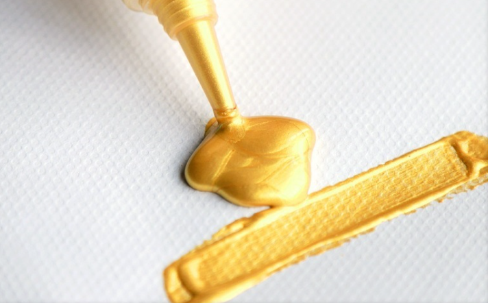
As a procurement professional, you have likely faced this scenario: You send a design to a factory featuring a beautiful, shiny gold logo. You receive the sample, and your heart sinks. The logo isn’t gold; it is a flat, uninspired brownish-yellow. It looks like mustard.
Why does this happen?
To educate your client or internal team, you need to understand the difference between Color Simulation and Material Property.
The CMYK Limitation
Most standard digital printing (used heavily in dye-sublimation for flags and scarves) relies on CMYK (Cyan, Magenta, Yellow, Black).
- The Physics: CMYK inks are translucent. They mix to create colors by filtering light.
- The Problem: Metallic gold is not just a color; it is a texture that reflects light. You cannot mix standard inks to create a reflection. The best a standard printer can do is print a photo of gold, which results in that flat “mustard” gradient.
The Solution: Spot Colors and Metallic Flakes
To get true metallic effects, we must move away from standard digital printing and move toward Screen Printing or Heat Transfers using specialty inks.
True metallic inks contain microscopic flakes of metal (aluminum, bronze, or copper) or pearlescent synthetic particles suspended in the ink base. When the ink dries/cures, these particles align to reflect light, creating the shimmer.
Part 3: The Technology Stack – Choosing the Right Method
Not all “shiny” prints are created equal. Depending on your budget, the fabric type, and the durability required, we recommend one of the following three methods for your sports swag.
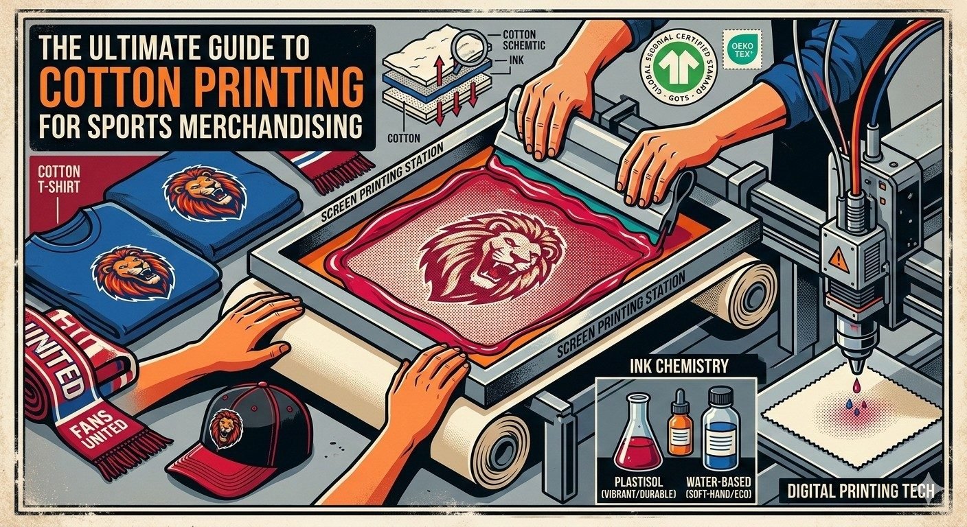
1. Metallic Silkscreen Printing (The Industry Standard)
This is the most common method for bulk orders of bucket hats and flags.
- How it works: We push a specially formulated ink (containing the metallic particles) through a mesh screen onto the fabric.
- The Look: It offers a “soft shimmer.” It is not a mirror finish (like chrome), but it sparkles under light.
- Best For: Cotton bucket hats, polyester flags, and satin scarves.
- Durability: High. It withstands washing well.
- Pro Tip: Ask your manufacturer about the “Mesh Count.” Metallic inks require a lower mesh count (larger holes in the screen) to allow the metal flakes to pass through. If the factory uses a standard screen, they will filter out the sparkle, leaving you with dull gray ink.
2. Foil Stamping (The “Bling” Effect)
If your client wants a logo that acts like a mirror, ink won’t suffice. You need foil.
- How it works: An adhesive glue is screen-printed onto the fabric in the shape of your design. A sheet of metallic foil is placed on top and heat-pressed. The foil sticks only to the glue.
- The Look: High-shine, mirror-like finish. Available in Gold, Silver, Rose Gold, and holographics.
- Best For: Commemorative items not meant for daily heavy wash, such as event-specific bucket hats or VIP gift bag items.
- The Trade-off: Foil can crack over time if the fabric stretches too much. It is less breathable than ink.
3. Metallic Heat Transfer Vinyl (HTV)
- How it works: The design is cut from a sheet of metallic vinyl and heat-pressed onto the product.
- Best For: Personalization (e.g., adding a specific player’s name in Gold to a hat) or smaller runs.
- The Look: Very sharp edges and a consistent plastic-like sheen.
Part 4: Application Guide – Product by Product
Different textiles react differently to metallic chemistry. Here is how we handle your specific product categories.
1. The Fisherman’s / Bucket Hat
Bucket hats are usually made of heavy cotton twill or canvas. This is the ideal surface for metallic printing.
- The Challenge: Crossing seams. If your logo is too big, it might cross the stitching lines of the hat, causing gaps in the print.
- The Recommendation: Keep metallic logos centered on the front panel. For a premium look, we recommend Silver Shimmer Ink on a Black Bucket Hat. The contrast is striking and looks incredibly expensive for a relatively low production cost.
2. Flags and Banners
Flags present a unique physics problem: Weight.
- The Challenge: Flags need to fly. Metallic inks are heavier than standard dye-sublimation inks because they sit on top of the fabric rather than dyeing the fibers. A heavy metallic print can make a flag droop in light wind.
- The “Bleed” Issue: Standard flags are “single reverse” (printed one side, visible on the other). Metallic ink will not bleed through to the back. The back of the metallic area will look gray or white.
- The Recommendation: Use metallic ink sparingly on flags—perhaps just for the border or the main text. Do not cover the whole background in metallic gold, or your flag will be as stiff as a board.
3. Scarves (The Tricky One)
Scarves come in two main varieties, and the approach changes completely for each.
- Scenario A: The Satin/Polyester “Summer” Scarf
- Verdict: Perfect for metallic screen printing. The smooth surface holds the ink well.
- Scenario B: The Knitted “Winter” Scarf (Acrylic)
- Verdict: DO NOT PRINT. You cannot screen print successfully on a chunky knit scarf; the ink will crack and break immediately.
- The Alternative: For knitted scarves, we use Lurex Yarn. This is a metallic thread woven directly into the fabric. Instead of printing a gold logo, we knit the gold logo using gold thread. This is durable, soft, and looks integrated rather than pasted on.
Part 5: Real-World Case Studies
To help you visualize the ROI of metallic printing, here are three examples from our recent production archives.
Case Study #1: The Championship Commemoration
Client: A European Football Club (Procurement Dept).
The Brief: The team had just won a league title. They needed 10,000 fan scarves to celebrate the victory. They wanted “GOLD” to be the main theme.
The Mistake: They originally requested a dye-sublimated scarf with a yellow gradient.
Our Intervention: We explained that “yellow is not gold.” We suggested a hybrid approach: A high-definition woven scarf with Lurex Gold Thread for the fringe and the text “CHAMPIONS.”
The Result: The metallic fringe caught the stadium lights during the victory lap. The merchandise sold out in 48 hours because it felt like a “collector’s item” rather than cheap merch.
Case Study #2: The VIP Music Festival Bucket Hat
Client: Beverage Brand Sponsor (Event Planner).
The Brief: 500 hats for VIP guests at a night-time EDM festival.
The Challenge: The logo needed to be visible in the dark.
The Solution: We used Reflective Silver Foil. While not strictly “metallic” in the traditional sense, it uses glass bead technology to reflect light back to the source.
The Result: When photos were taken with flash, the logos on the hats glowed bright white/silver. The social media impact was massive because the hats “interacted” with phone cameras.
Case Study #3: The Corporate Anniversary Flag
Client: A Banking Institution celebrating 50 years.
The Brief: Desk flags and large outdoor flags.
The Solution: For the outdoor flags, we used standard printing for durability. But for the indoor ceremonial flags, we utilized Gold Foil Stamping on velvet fabric.
The Result: The flags looked regal and appropriate for a high-stakes board meeting, conveying stability and wealth.
Part 6: A Checklist for Procurement Managers
If you are ready to order metallic sports promotional items, use this checklist to ensure you get exactly what you envision.
- Specify “Shimmer” or “Mirror”: Be clear. Do you want a soft sparkle (Ink) or a hard reflection (Foil)?
- Request the Pantone Metallic Code: Do not just say “Gold.” Say “Pantone 871 C” (a classic gold) or “Pantone 877 C” (silver). This gives the factory a chemical standard to match.
- Check the Fabric:
- Smooth (Twill, Satin, Polyester) = Print is okay.
- Rough/Texture (Knits, Fleece) = Embroidery or Lurex yarn is better.
- Ask for a “Strike-off”: Never go straight to mass production with metallics. Ask for a pre-production sample (strike-off) to check the wash fastness. Rub the metallic print with your thumb; if flakes come off on your skin, the curing process was poor.
- Wash Care Labels: Metallic prints are sensitive to heat. Ensure your product label says “Cold Wash / Do Not Tumble Dry.”
Conclusion: Go for Gold
In a market saturated with standard promotional products, metallic printing is your secret weapon. It elevates a simple bucket hat into a fashion statement and turns a team flag into a symbol of glory.
Yes, it costs slightly more than standard ink. Yes, it requires more technical oversight. But when your customers see that shimmer, the perceived value of your brand rises instantly.
Are you ready to add the Midas touch to your next campaign? Contact our team today to discuss how we can integrate metallic technologies into your next order of scarves, hats, or flags.